High Reading Standards | Branding - Website & App
From Doom-Scrolling to Dog-Eared Pages: A Brand Built on Nostalgia
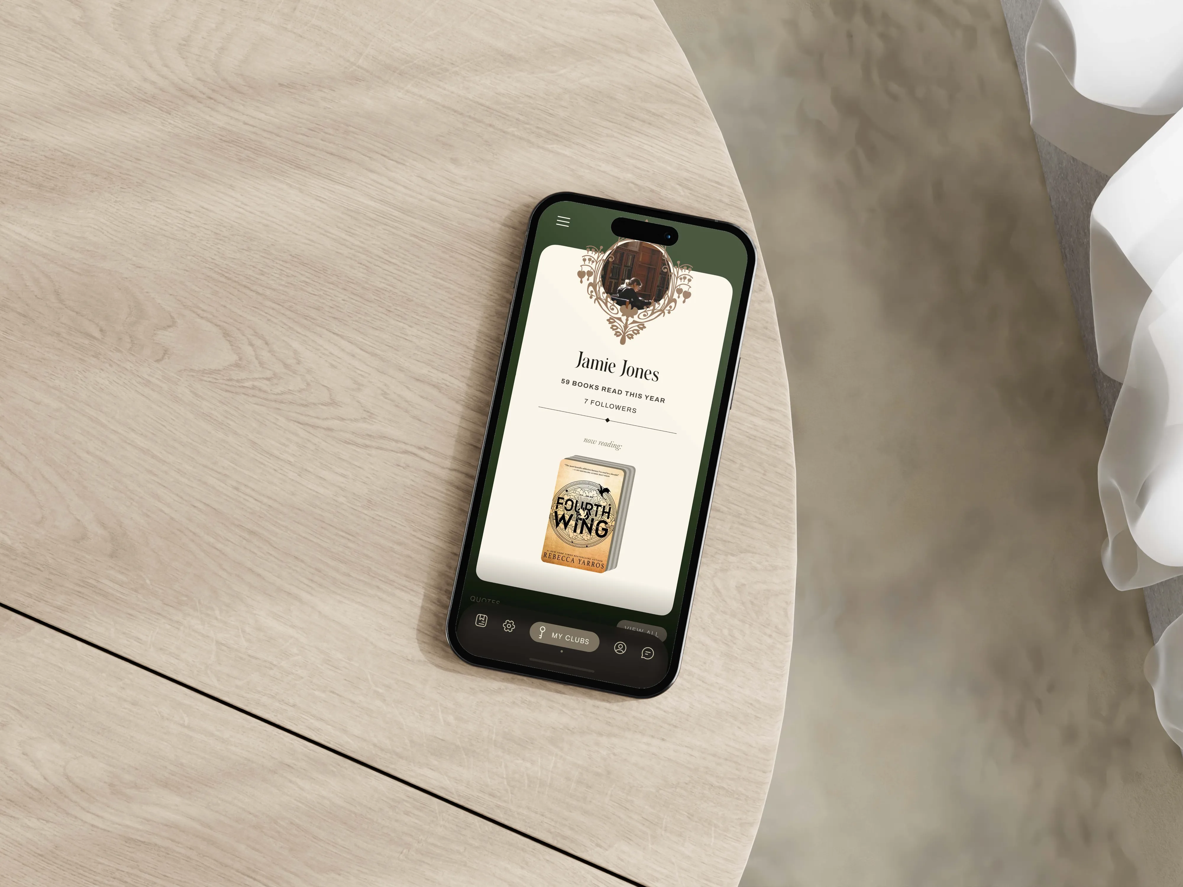
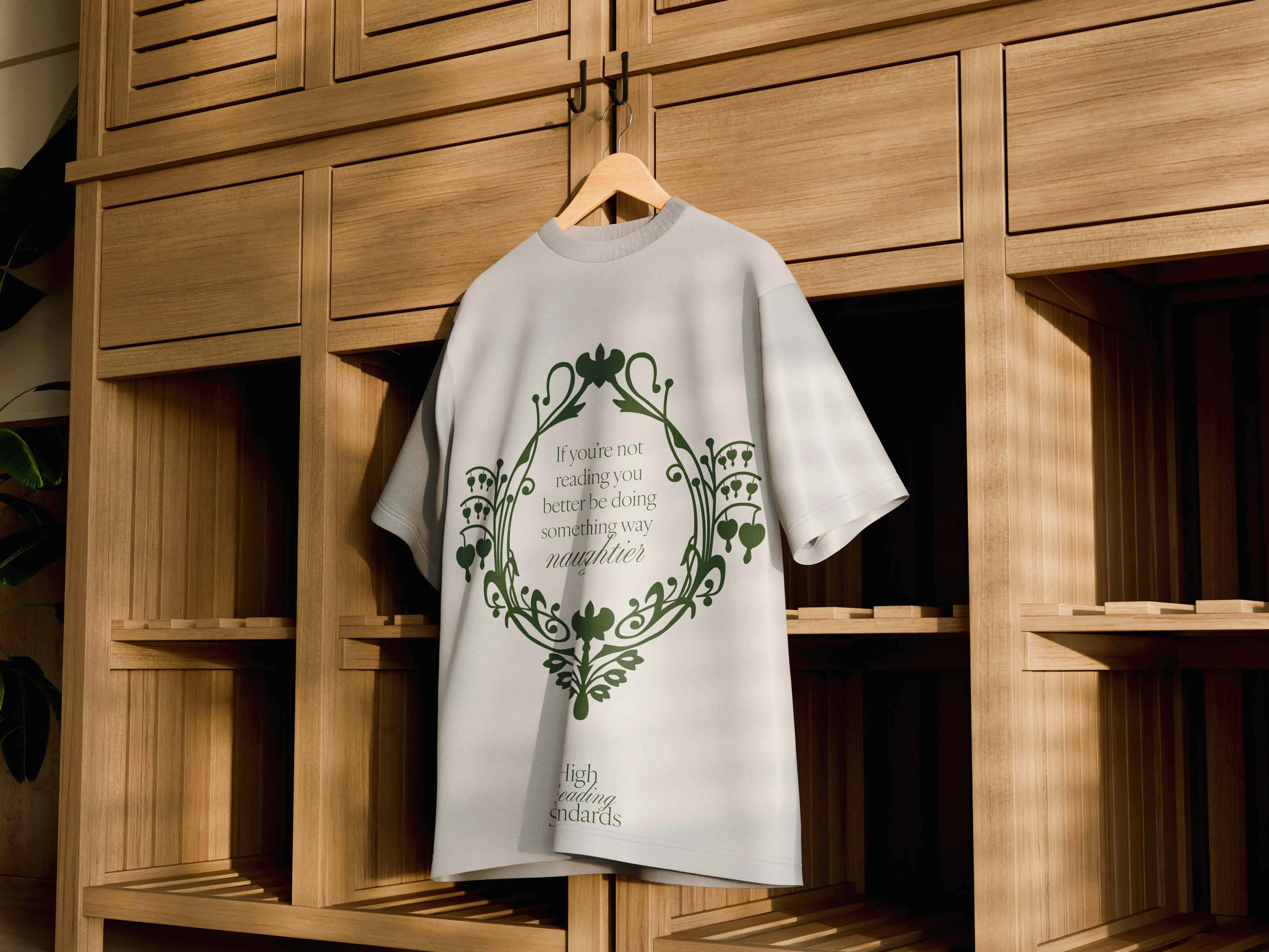
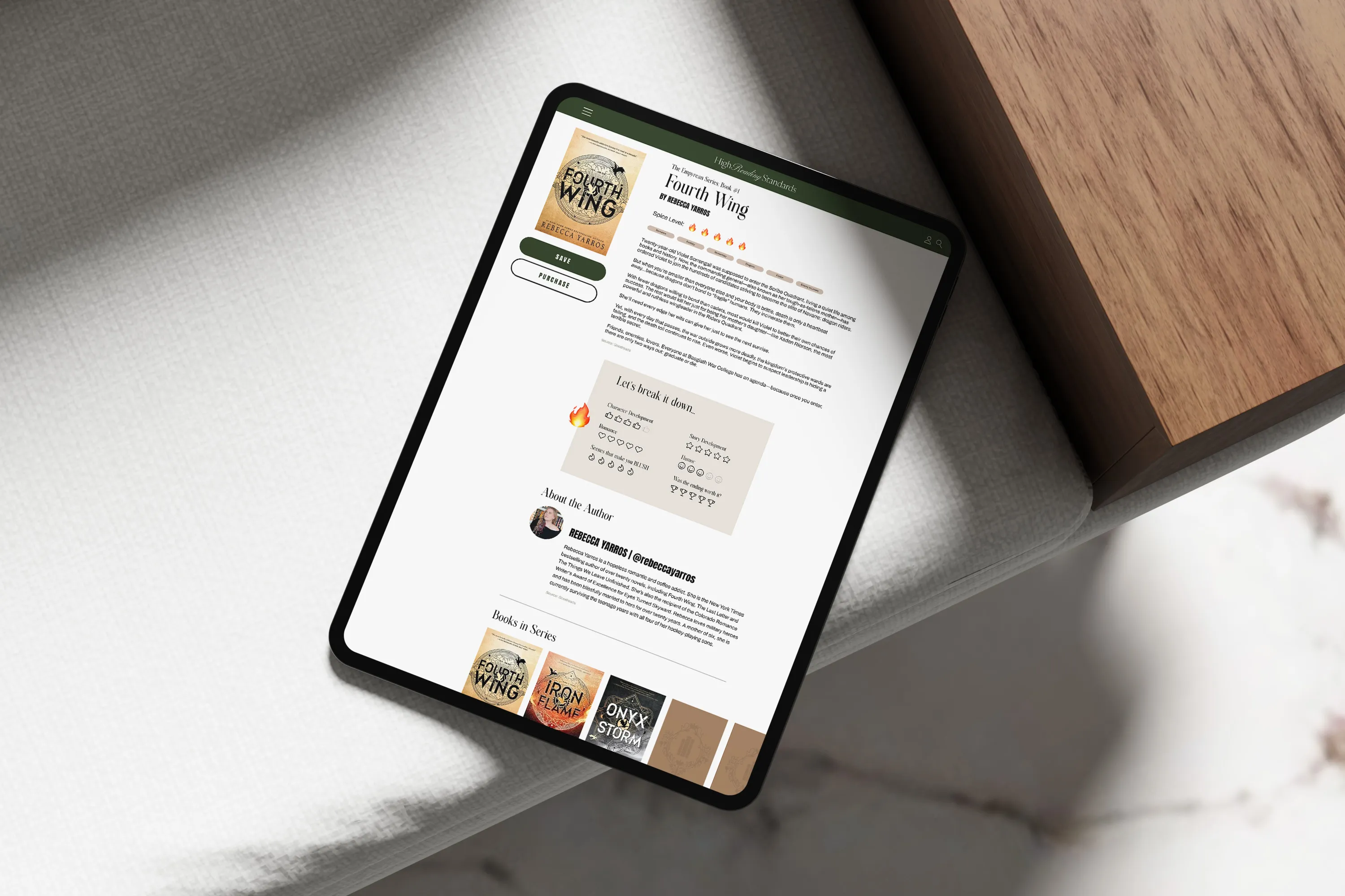
Initially, when my client asked me to create this brand, we ended up talking about BookTok for hours—what was wrong with it, what worked, and what truly stood out. After that conversation, Instagram was top of mind for me. I created these initial logos for her. The whole reason my client began reading again, and ultimately created her blog, was to step away from her phone and rediscover the feeling of being swept away by books. As we talked more, she shared that it was her grandmother who first introduced her to the joy and love of reading. From that conversation, the idea of a crest was born—one that subtly includes her grandmother’s favorite flower: the bleeding heart. We ultimately landed on a beautiful, classical library aesthetic—something that feels almost collegiate and just the right amount of dusty. After all, no one wants to sit in a sterile, uninviting library with no warmth, no dust, and no well-loved, torn pages. There’s charm in the imperfections, and that’s exactly what we wanted to capture.